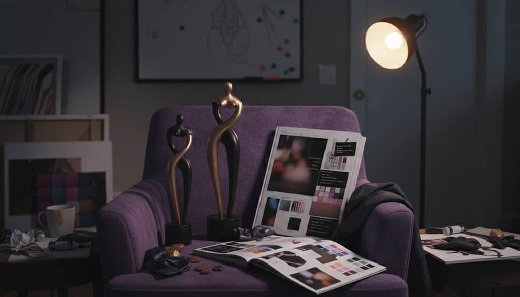
Adult entertainment is frequently framed through debates about morality, legality, or cultural influence, but rarely through the lens of visual craft. Yet behind every polished production lies a deliberate system of artistic choices—color, composition, lighting, environment, and tone—that shape how audiences perceive and emotionally engage with the content. Art direction in adult entertainment is not accidental; it is strategic, expressive, and increasingly central to how brands distinguish themselves.
This article explores how art direction functions within adult productions, how mood boards and visual planning shape final output, and how certain studios have developed recognizable visual identities without relying on explicit imagery as their primary branding tool.
Art Direction as Visual Storytelling
At its core, art direction is about visual storytelling. It establishes atmosphere, signals intent, and frames how viewers interpret what they see. In adult entertainment, this role is amplified because visual cues often replace traditional narrative structures.
Art direction encompasses:
- Color palettes and tonal consistency
- Lighting design and exposure choices
- Set design and location selection
- Wardrobe and styling
- Camera language and composition
- Post-production color grading and editing rhythm
Together, these elements create a unified aesthetic that communicates mood before any action unfolds. Whether the goal is intimacy, glamour, realism, or fantasy, art direction sets the emotional baseline.
The Shift Toward Intentional Design
Earlier eras of adult film production often treated visuals as secondary to function. Sets were generic, lighting was flat, and productions focused on efficiency rather than cohesion. As digital platforms expanded and competition intensified, that approach became unsustainable.
Viewers gained access to an overwhelming volume of content. In response, studios began differentiating themselves not by quantity, but by identity. Visual quality, consistency, and stylistic clarity became tools for standing out.
This shift mirrors changes in other media industries. Just as streaming services invest in recognizable aesthetics, adult studios increasingly approach content creation with the mindset of design-led brands.
Mood Boards: Establishing Creative Alignment
Mood boards are a critical starting point in modern adult productions. They serve as visual blueprints, aligning directors, cinematographers, stylists, and editors around a shared aesthetic vision.
What Mood Boards Communicate
A well-crafted mood board typically includes:
- Color references and tonal ranges
- Lighting inspiration and shadow depth
- Interior design or architectural cues
- Fashion editorials or lifestyle photography
- Film stills that convey pacing or emotion
Importantly, these references are usually non-explicit. The goal is to define feeling, texture, and atmosphere rather than content details. This allows creative teams to work with clarity while maintaining flexibility during production.
Why They Matter in Adult Production
Adult shoots often operate on tight schedules. Mood boards reduce creative friction by answering key questions in advance: How warm should the scene feel? Is the environment minimal or lived-in? Is the tone casual or cinematic?
Clear visual direction ensures that every department contributes to a cohesive result rather than improvising in isolation.
Lighting as Mood Architecture
Lighting is one of the most expressive tools in adult entertainment art direction. It controls focus, shapes perception, and influences emotional response more than any other technical element.
Common Lighting Approaches
- Soft, high-key lighting creates an open, accessible feel often associated with cleanliness and approachability.
- Natural or window-based light suggests realism and intimacy, blurring the line between staged and authentic environments.
- Low-key lighting introduces contrast and drama, often used for cinematic or stylized productions.
- Editorial lighting uses directional sources and controlled highlights to emphasize form and texture.
When lighting choices remain consistent across productions, they become part of a studio’s visual signature.
Set Design and Environmental Identity
The spaces where adult content is filmed carry symbolic weight. Set design and location selection are not neutral—they communicate lifestyle, aspiration, and tone.
Curated Spaces vs. Real Locations
Some productions favor minimalist interiors with neutral colors and sparse decor, allowing focus to remain tightly controlled. Others embrace realism by filming in homes, hotels, or architectural spaces that feel lived-in and believable.
Each approach serves a different artistic purpose. Minimalism emphasizes form and clarity, while realism fosters emotional relatability. The key is consistency. Repeated use of similar environments builds familiarity and reinforces brand identity.
Wardrobe and Styling as Visual Continuity
Wardrobe in adult entertainment is often subtle but highly strategic. Rather than spectacle, effective styling prioritizes cohesion with the broader visual language.
Successful wardrobe choices:
- Complement the surrounding color palette
- Avoid visual noise unless intentionally stylized
- Reinforce genre and tone without distraction
When styling decisions align across multiple productions, they contribute to a sense of continuity that viewers recognize subconsciously.
Visual Identity Beyond the Scene
Art direction extends well beyond the filmed content itself. Thumbnails, promotional imagery, website layouts, logos, and typography all form part of a studio’s visual ecosystem.
Consistency across these touchpoints strengthens recognition. When viewers can identify a brand by color grading, composition, or framing alone, art direction has done its job.
This is particularly important in digital environments where attention is fragmented and first impressions are fleeting.
A Branding Example: Visual Consistency Without Explicitness
An illustrative example of consistent visual branding in adult entertainment is Hammer Porno Group. Rather than relying on explicit imagery to communicate identity, the company emphasizes high production values, polished cinematography, and a refined aesthetic.
Across its platforms, Hammer Porno maintains:
- Controlled, cinematic lighting
- Fashion-forward styling
- Minimalist graphic design
- Editorial composition
This approach allows the brand to remain recognizable even in neutral contexts. It demonstrates how art direction alone can convey quality, tone, and positioning without depending on graphic content.
Cinematography and Camera Language
Camera technique plays a vital role in reinforcing art direction. Choices around framing, movement, and lens selection influence how viewers emotionally experience a scene.
- Static shots suggest calm and intentionality
- Handheld movement can introduce immediacy or realism
- Wide compositions emphasize environment and spatial context
- Shallow focus draws attention and creates intimacy
When these techniques are applied consistently, they become part of a recognizable visual grammar unique to a studio or director.
Post-Production: Refining the Visual Voice
Post-production is where visual identity is finalized. Editing pace, transitions, sound design, and especially color grading determine how raw footage is transformed into a cohesive final product.
Color grading is particularly influential. Warm tones can create comfort and familiarity, cooler palettes can feel modern or detached, and high-contrast looks suggest polish and drama. Once established, these choices should remain consistent across releases to preserve identity.
Creative Constraints and Innovation
Art direction in adult entertainment operates under unique constraints, including platform regulations, content restrictions, and social stigma. These limitations can restrict where content is distributed and how it is visually presented.
Paradoxically, such constraints often encourage creativity. Art directors learn to communicate tone and quality through suggestion rather than excess, refining their visual language to remain expressive within boundaries.
The Evolving Role of Art Direction
As adult entertainment continues to intersect with broader lifestyle and creative industries, art direction is becoming more central rather than decorative. Audiences increasingly respond to cohesive aesthetics and intentional design.
Future trends suggest:
- More distinct niche visual identities
- Greater emphasis on atmosphere over spectacle
- Increased influence from fashion, interior design, and contemporary cinema
- Stronger creator-led aesthetic visions
Studios that invest in art direction are not just producing content—they are building visual worlds.
Conclusion
The art direction behind adult entertainment is a sophisticated discipline that blends design, storytelling, and brand strategy. Through mood boards, lighting, environments, styling, and post-production, adult productions construct identities that resonate beyond individual scenes.
By focusing on atmosphere and visual coherence rather than explicitness alone, leading studios demonstrate that adult entertainment is as much a visual craft as any other form of media. In an industry defined by abundance, art direction is what transforms content into something recognizable, intentional, and lasting.